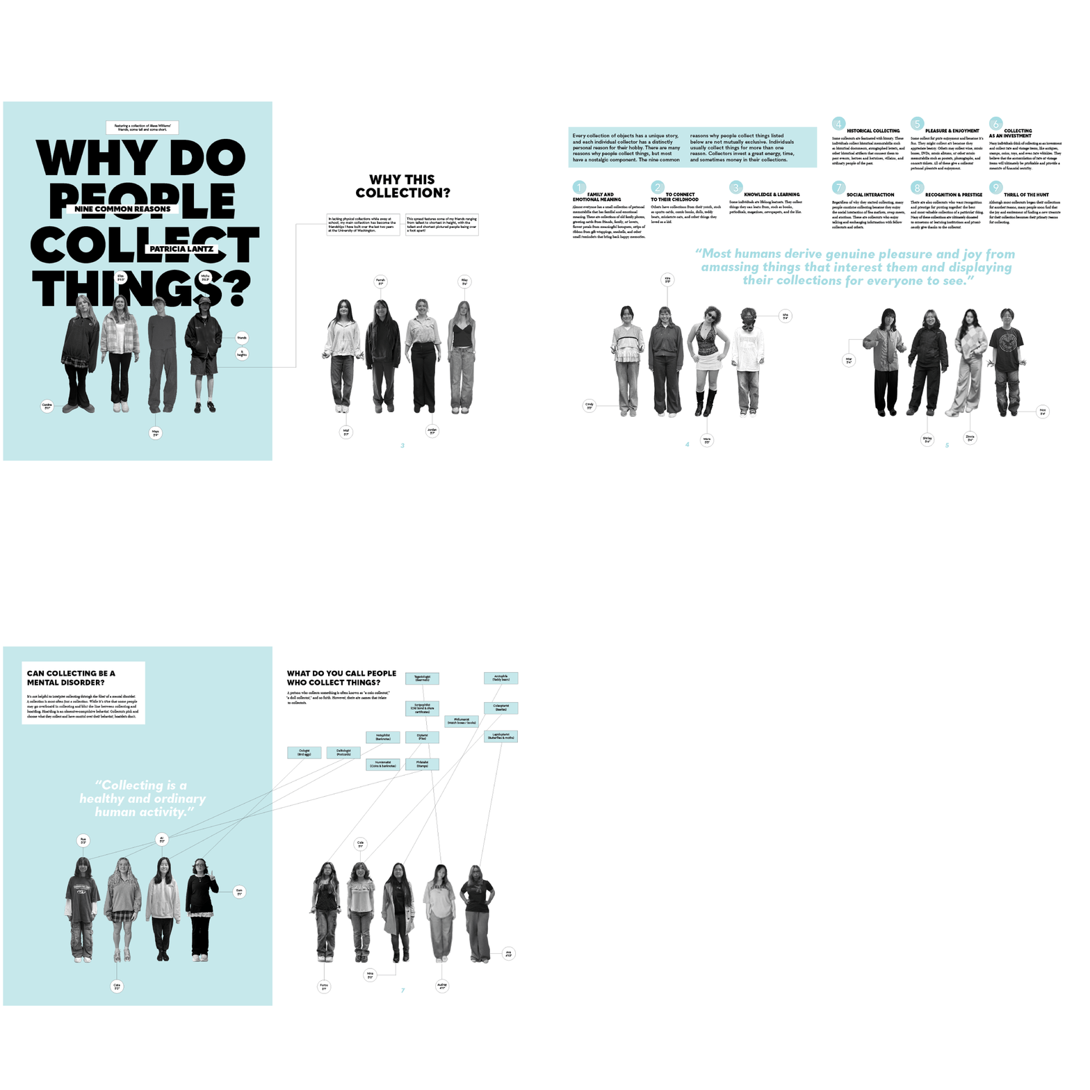
In the name of using design skills as an outlet of creativity and enjoyment, I chose to create a six spread documentation of my friends and a collection of their heights.
Timeline
3 weeks
Project Overview
Using Flat-Stanley-esque images of my friends, I dramaticised height differences through the use of scale and by organizing them in the order of tallest to shortest.
Each individual is marked only by their name and their height, using grayscale to unite everyone and highlight height differences even further. The use of blue and other simple shapes are spread throughout to unify the graphic and add a sense of silliness to the rest of the spreads.
Challenge
Finding a means of organizing my friends for this collection was initially a struggle with so many ways to order them or scatter them around my collection. Adding in heights as the key point allowed for clean organization with noticeable differences existing throughout the pages of the spreads.


Results
The redesigned experience made the platform more intuitive and significantly improved user satisfaction. Cleaner navigation, simplified workflows, and a refined visual system helped increase engagement while reducing friction throughout the product.

